

Bank of Springfield
Bank Boldly.
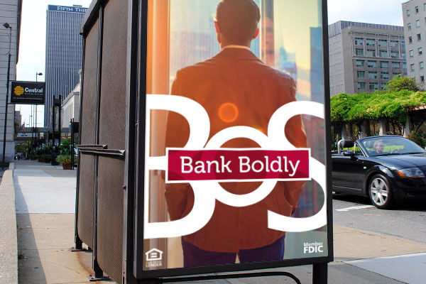
I took the lead on a bold rebrand that gave Bank of Springfield a visual identity as confident as its name. With striking shapes, clean interfaces, and standout messaging, we helped this regional institution look like a national player. The creative system extended from digital banking tools to brand campaigns—consistent, energetic, and unmistakably modern.
Scope: Brand identity, digital product UI/UX, campaign design, content strategy.


The Challenge
Bank of Springfield wanted to refresh its website to better reflect its community-driven brand while improving accessibility and responsiveness for modern banking users.
My Role
Creative Director — led UX strategy, interface design, and cross-team collaboration with developers.
Process
-
Conducted competitor analysis and benchmarked against regional banks.
-
Designed mobile-first wireframes with accessibility standards in mind.
-
Directed design production to ensure visual consistency across all digital touchpoints.
The Solution
A modern, trustworthy banking experience optimized for mobile customers and consistent with BOS’s community values.
Impact
-
Enhanced trust and credibility with an updated visual language.
-
Significantly reduced bounce rates on high-traffic pages like “Open an Account.”
-
Strengthened BOS’s positioning against larger national competitors.

Other pieces

BOS
Display marketing

BANK BOLDY
See what a bank that puts your intest first can do for you.
BOS
Outdoor

BOS
Website